Rebekah Terry
UI/UX Designer. Illustrator.
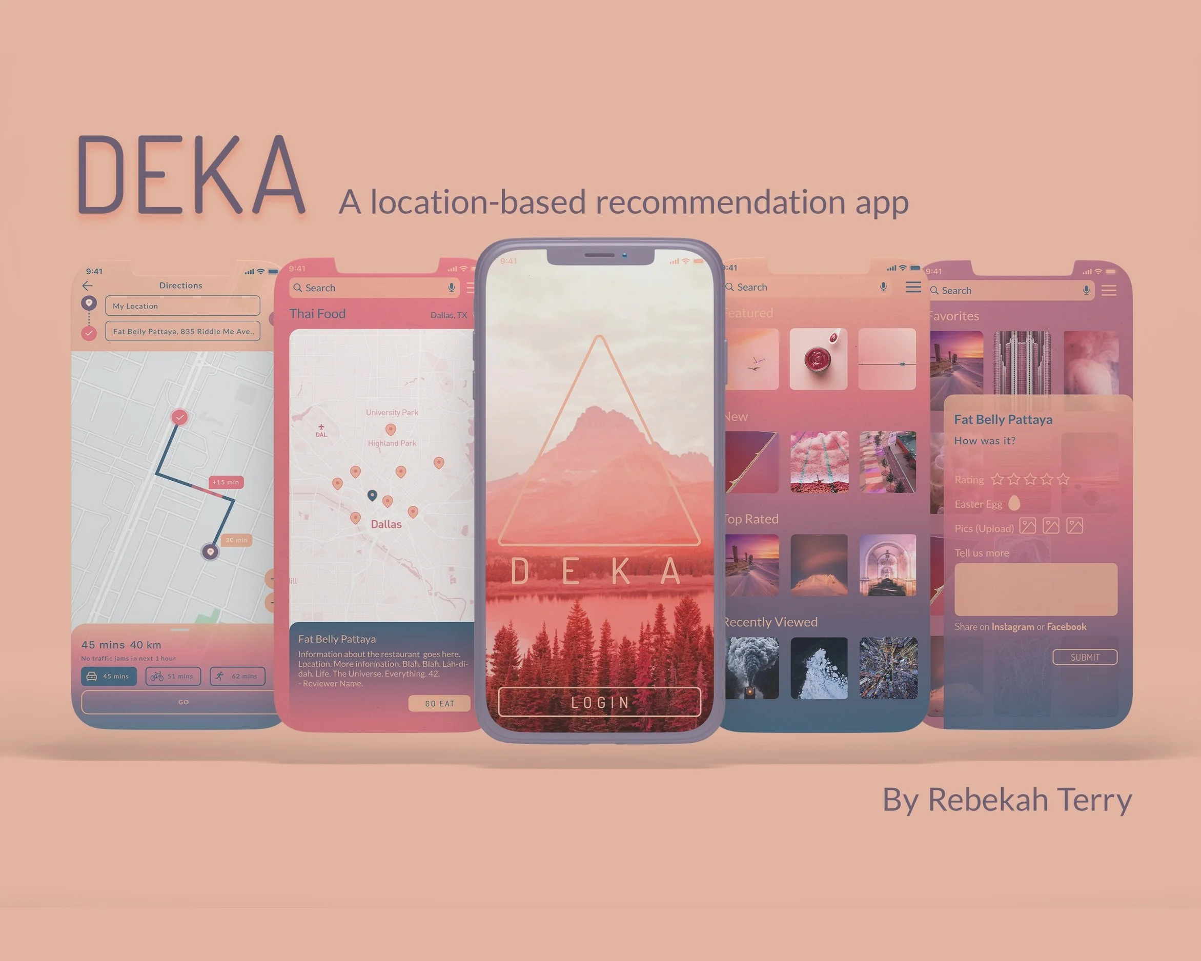
Deka
Overview
Deka, from the Greek word for “ten,” provides great recommendations to the user, wherever they may be. Specifically, it gives them the Top 10 Recommendations, for whatever they require, whether it’s the best Thai Food Restaurants, the Top Things to Do in a City, the Top Ten Concerts, etc. Using Hick’s Law, Deka aims to limit the amount of choices the user has so they aren’t overwhelmed by sifting through reviews, but can instead rely on Deka’s recommenders to provide them the best of the best. Not only does it provide reviews for multiple categories in multiple cities, it also shows the locations of the places, provides the user the ability to navigate to their chosen recommendations, favorite recommendations for the future, and write reviews.
Purpose and Context
This project was created for class. The design brief was to create a location-based recommendation app. I looked at several existing apps, including Yelp, Google Reviews, and TripAdvisor, and one thing I noticed was that they all depended on masses of reviews, but also that there were some inherent biases built into this review process. Older listings continued to be seen first and reviewed more often because they had more hits because they had been around longer, not necessarily because they were the best. Also, users would get frustrated and experience fatigue by reading multiple conflicting reviews from users who had wonderful experiences, and others who had terrible experiences.
Objective
My objective was to simplify this search process, and eliminate user fatigue. Instead of forcing users to sift through dozens of reviews and look at dozens of recommendations, I used Hick’s Law to limit their choices to the best, and the Top Ten in each category, more specifically. These ten would be selected by top experts or reviewers in each area.
Approach
I organized the home page similar to Tripadvisor, and sorted activities and restaurants accordingly. When a user selects a category it opens onto a map, similar to Google, and shows the locations of the recommendations. Users can click on the map pins to read more about each recommendation and take an action from there, whether it’s to buy a ticket or navigate to a restaurant or museum.
Challenge
This app was an earlier one I created, and so one of the biggest challenges was when I decided to go back and redesign it. Ultimately, it looked too similar to another app I had created. Also, I thought the design was a bit clunky, and I wanted to bring a beautiful bright feel, that of a sunrise (thus the gradient of colors from blue, purple, pink, and peach) which invoked travel, adventure, and new days full of new surprises. It took me a few weeks of intensive work to redesign it, but ultimately I’m so happy I did, and it taught me a lot about letting go of what doesn’t work in favor of what does.
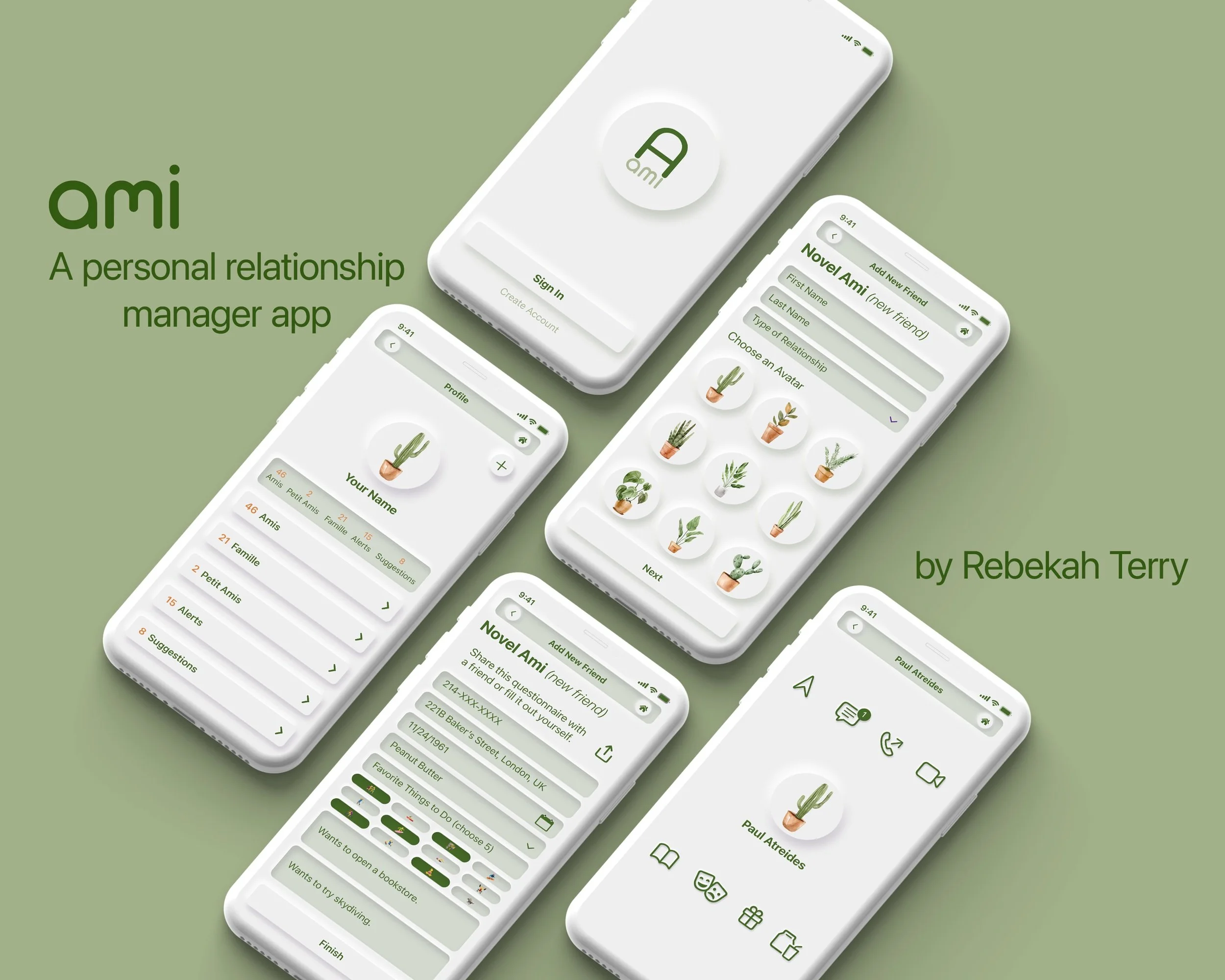
Ami
Overview
Ami is a PRM (Personal Relationship Manager) App that helps the user to better maintain and keep in contact with the people in their lives who are most important to them. Similar to a CRM (Customer Relationship Manager), Ami stores information about your closest family, friends, and loved ones, gives reminders to contact them, and provides recommendations.
Purpose and Context
The purpose of Ami is to help bring people closer together and strengthen their communication. Inspired by CRMs that remind users to contact customers and that stores information about them, Ami makes it easy for users to keep in contact with and store information about the people in their lives who are closest to them.
Objective
To create an original app idea for my course, develop 4-5 functionalities and user flows, and create high-fidelity wireframes to demonstrate these user flowers.
Approach
Ami provides reminders to text, call, email, or video chat with your friends, family, and love interests. It even gives conversation starters and allows the user to text, call, or video chat directly from the contact’s profile. What about recommendations? The more Ami knows, the more it can recommend. If the user’s girlfriend Abby likes to hike, then Ami might recommend some of the best trails nearby. If Ami’s Uncle Jack loves craft beer, Ami might recommend taking him to a brewery, or buying him a new brew that he might like. The more the user interacts with Ami, the more their relationships grow, and this is also reflected in their contacts’ avatars, represented by plants, which also grow the more the user interacts with that contact.
Challenge
The challenge for this app was designing something new that I haven’t seen before on the market. Although I was inspired by CRMs, I wanted something fun as well as functional. When coming up with the ideas of avatars to represent the user’s contacts, I was reminded of Tamagotchis that thrive or decline based on the level of interaction. I thought if I could create something useful, that would help people maintain their communication with friends or family, coupled with recommendations for things to do, places to eat, and gift possibilities, as well as gamifying the experience with the growing plant avatars, that users would be intrigued and engaged.
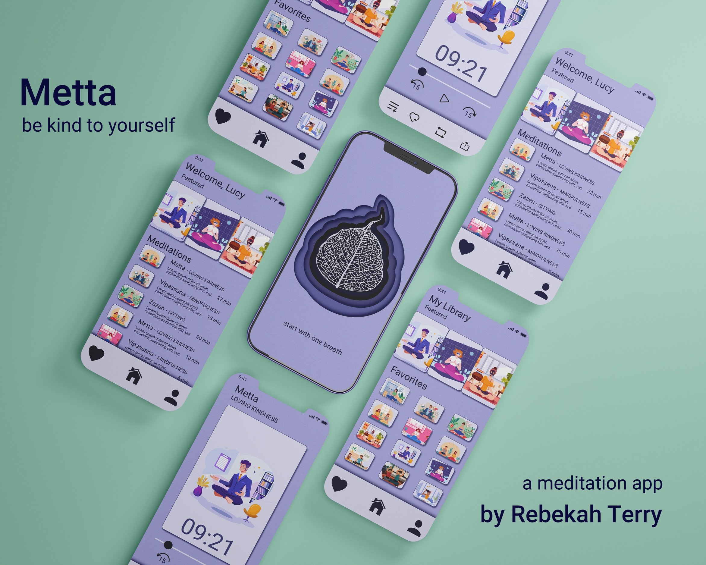
Metta
Overview
Metta is a form of meditation so often overlooked. This type of meditation helps the user practice loving-kindness—towards themselves and others. Users can expand and deepen the love and kindness they have for themselves, or participate in other guided meditations. These meditations include Vipassana (mindfulness), or Zazen (sitting), with various guides and for different amounts of time depending on the user’s preferences and time constraints.
Purpose and Context
This project was created for class. In this scenario, I was meant to develop the first prototype of a meditation app. I was asked to design the 3-5 main app screens and integrate motion into them. My role was to develop motion concepts using storyboards, showcasing examples of 1) transitions between the screens and 2) screen-specific details like microinteractions. At the beginning of the project, I decided which core brand values should be expressed in the app, and provided the client with style fundamentals like the color scheme and fonts. I was also responsible for getting feedback from my team and creating a video presentation for project stakeholders.
Objective
My objective was to create an app that made the user feel calm, acceptance, and present in the moment. I wanted to showcase these values, as well as present an app that was easy to navigate and which met the requirements of my design brief.
Approach
The low fidelity wireframes were provided to me, but the animations and user interactions were left entirely up to me. I wanted the transitions and interactions to be a reflection of the values of the app. Everything should be smooth, gentle, and calming. The preloader, for example, was timed with the cadence of someone breathing in and out, as you would when you meditate.
Challenge
As this was my first solo project using After Effects, the challenge here was not only deciding what I wanted to do, but figuring out how to do it and if it was feasible and didn’t take away from the user’s experience. I approached this challenge by making sure to carefully storyboard the animations so I could better implement what I wanted to do and where.
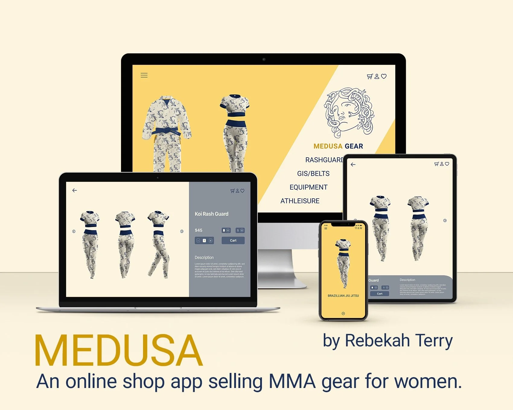
Medusa
Medusa Gear is an MMA clothing and supply store specifically geared toward women athletes. Medusa prides itself on producing high-quality gear with beautiful designs at an affordable price point. It strives to make shopping quick and easy, making it simple to add items to a cart or save them for later.
Thoughts
Overview
Thoughts is a minimal, straight-forward app that allows users to quickly and easily take notes, make checklists, store photos, and, in general, keep track of their thoughts. Its design is cute and fun, with lines drawn purposefully outside the note and checklist boundaries in order to visually promote outside-the-box ideas.
Purpose and Context
Thoughts, a notes and checklist app, was created for my course as an exercise in developing an app quickly and with a minimal brief. My only guidance was “a note-taking app à la “less, but better,” that it is shaped mostly by functionalism, and a delivery of high-fidelity wireframes for “5 screens so they can pitch the concept to their investors.”
Objective / Approach
Since there wasn’t much guidance on this project besides creating a note and checklist app that was simple, I took it upon myself to create the core functionalities of the app. So I created a homepage that makes it easy to see all the latest notes and checklists a user has created, easily add a new note or checklist, and easily search for and organize existing notes and checklists.
Challenge
The challenge for this app was speed, and I really enjoyed it. It forced me to simplify the process and really focus on the MVP, Minimum Viable Product, and what key functions the user would need to use and enjoy the app.
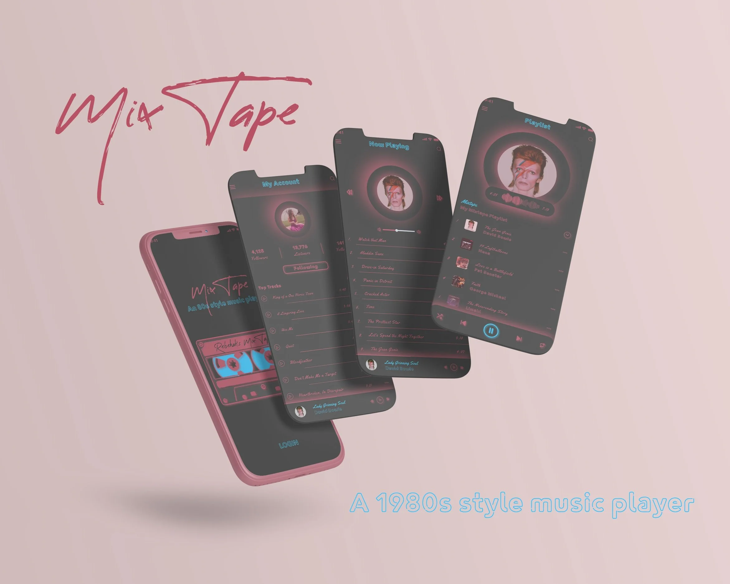
MixTape
Overview
MixTape is an 80s style music player app for 35-55 year olds. This was my first assignment for my UI program. The first few iterations of this app looked very amateurish, but this last version is something of which I’m proud. I wanted to invoke that neon look with bright pink and blue against a black backdrop. The frames I created show a Login Screen, an Account Screen with the top tracks the user has listened to, a “Now Playing” page that shows what the user is currently listening to, and the MixTape Playlist page that shows a custom MixTape made specifically for the user.
Purpose and Context
This project was created for class. The design brief was simple: an 80s style music player with 2-3 basic functionalities. I tried to invoke an 80s night life with the black backdrop and pink and blue neon. To top it off, I included famous hits from the 80s featured on the app. The 2-3 functionality I included were a login page, an account page, a playlist page, and a now playing page.
Objective
My objective was simple: create a fun, easy-to-use music player that brings to life the 80s nostalgia of the user. I didn’t need to create something new in terms of functionality, but merely re-dress it for the user’s pleasure.
Approach
I wanted to use functionalities already known to the user, so I kept it clean and simple. The only potentially new feature is the mixtape feature, which creates playlists based on the user’s taste in music, but this is similar to functionalities found in Apple’s and Spotify’s Recommended Music features.
Challenge
The biggest challenge I faced was making a modern music player harken back to technologies of the 80s. I went through a few iterations, but finally found a middle ground that looks both sleek and retro. The original was very clunky and rough. But, in this instance, I think it shows my development as a designer over time. I wouldn’t change that process as I needed to go through it in order to create something new and interesting.
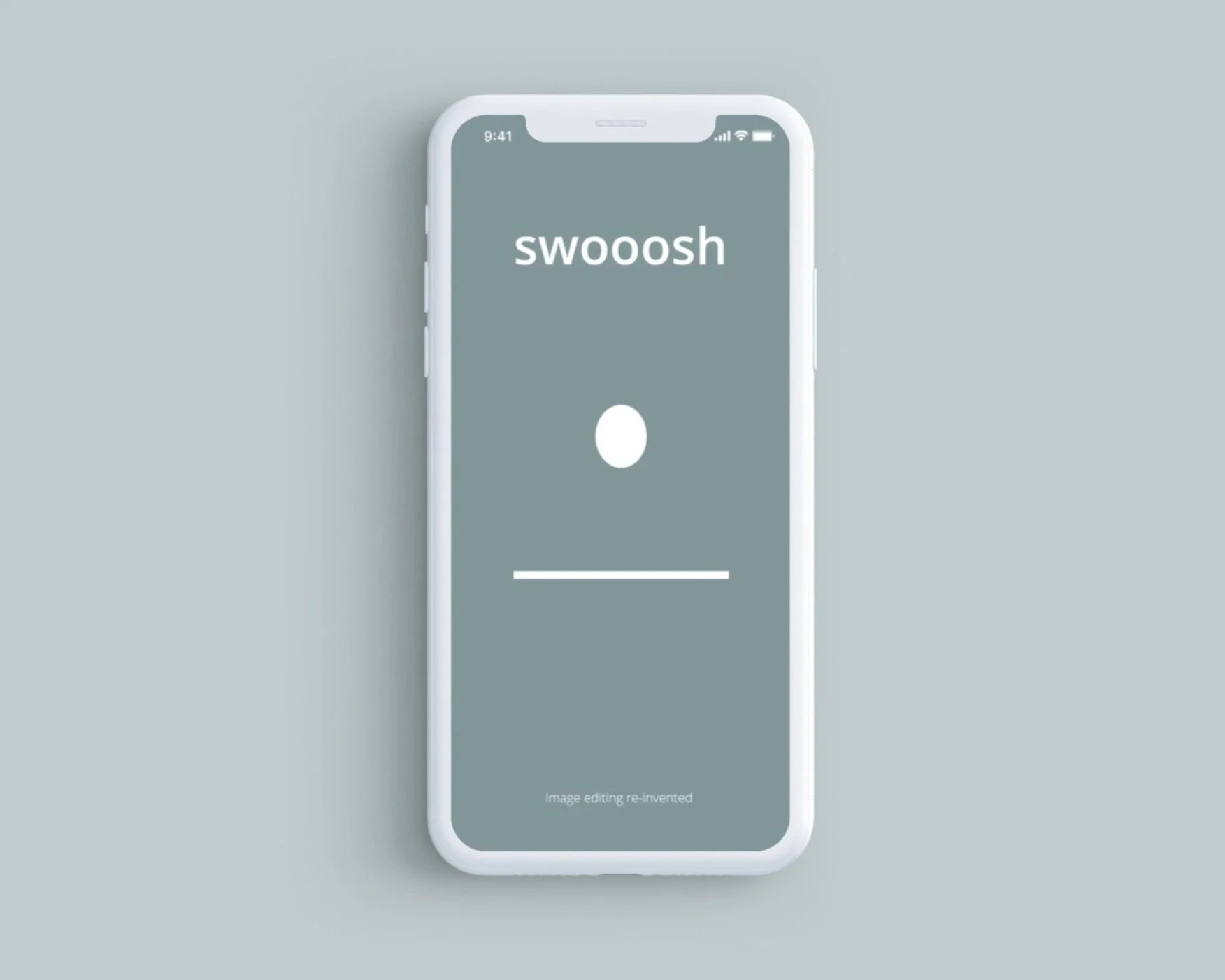
Swoosh Animation
A Simple series of animations completed for my first achievement in my Animation in UI course.
I had to create a:
pre-loader screen with a bouncing ball
followed by an activated menu icon which transformed into an arrow and back again, as well as changes colors
a sliding menu page with menu items
an activated photo which zooms and fills the page when clicked
and bottom menus that slide up when the photo is selected.
All animations were then put into a mock-up to simulate what they would look like on a phone. The colors choices and some other features were altered to make the animation uniquely mine.
I then used Media Encoder, the Bodymovin plugin, and LottieFiles to render the menu icon and preloader screens into gifs and prepare them for send off to a developer.